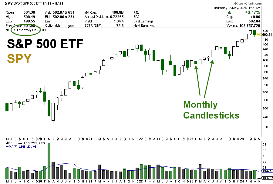
I am a big fan of monthly candlestick charts because they provide me with a panoramic view of market movements.
Don’t get me wrong. Daily charts are great. But you can only get so much information from a short-term chart.
Unlike daily charts, monthly charts provide traders/investors with major trend visibility and volume visibility.
Below you will see an example of a monthly candlestick chart. Each candle on the chart represents an entire month of price data, not just a single day as in daily candlestick charts.
Monthly Candlestick Chart of the S&P 500 ETF (SPY)

By condensing the price action of an entire month into a single candlestick, a monthly chart offers clarity and insight into the underlying sentiment driving market trends. This broader perspective helps filter out the ‘noise’ created by short-term fluctuations that can mislead and misdirect new and even experienced traders.
The Value of Monthly Candlestick Charts
The true value of monthly candlestick charts lies in their ability to highlight significant patterns and trends that are developing over a longer period.
Whether it’s identifying a potential reversal after a lengthy downtrend or confirming the strength of an ongoing rally, monthly charts give traders a strategic edge.
Recently, I shared over 40 monthly candlestick charts and explained in detail how I analyze them to detect patterns and trends.
Remember, in trading as in life, the ability to see the big picture not only informs better decisions but also fosters a calm, calculated approach to the markets.


